Quinacridone Violet
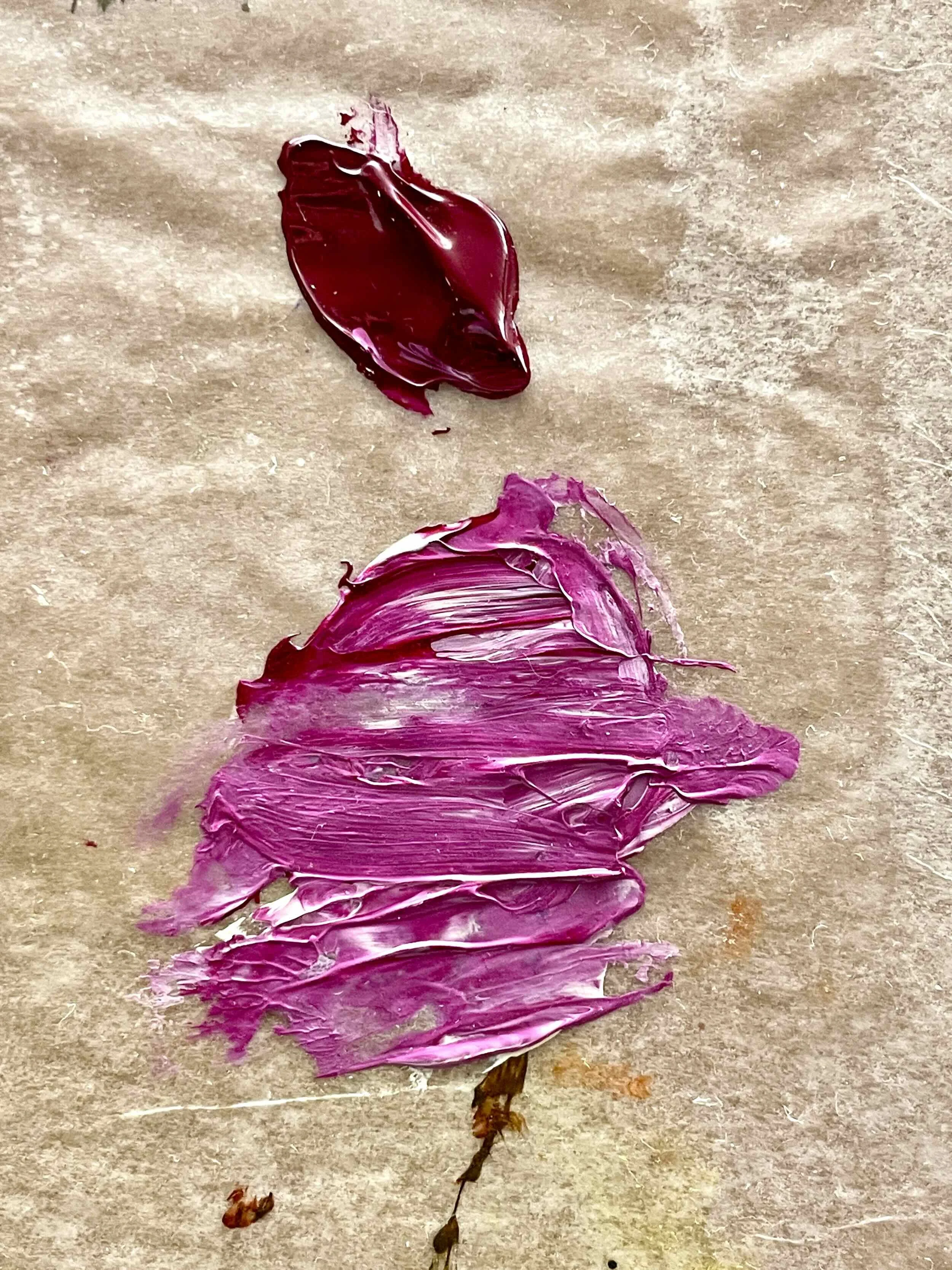
The name may not roll effortlessly off the tongue, but it’s a powerful color that necessitates your attention. It stands on its own, yet mixes well with other colors to form a wide array of hues. Q violet makes me think of the start of a sunrise, hibiscus flowers, and raspberries. There’s something luscious and lip-smacking good about it.
I remember first buying this color a few years ago at Artisan Art Supply in Santa Fe, NM. Purples and violets have always been my favorite colors. At the time I didn’t have a strong violet in my collection of paints, and this tube of Golden acrylics called out to me.
I even remember my first use of it. After applying some titan buff to a sheet of mixed media paper, I squeezed a line of q violet straight from the tube onto the paper. Using a spray bottle I spritzed the paint, tipping the paper so I could watch the drips make their way down the page. Some charcoal marks, a few more strokes of paint, and I found the work complete. Am I Up or Am I Down?

Am I Up or Am I Down? acrylic and charcoal on 24” x 18” mixed media paper
The more I think about it, the more I realize how much this color has got it going on. It can be bold, and it can be subtle. It works straight from the tube, yet mixes well. And when I think of all the ways it shows up in nature via blooms, bands of color in the sky, ripe berries, I am reminded of those colorful memories.
Can you remember the last time you found violet in your day-to-day life? What was it? Where were you? What feelings does violet evoke within you? Share your stories, photos, or favorite memory in the comments below. Or tag them with #MyColorJournal on social media.